
The Algorithmic Aesthetic
In this deep dive, we'll explore the design language evolving around AI integration in smartphones and its connection to the long history of making algorithm functionality user-friendly and appealing.
Welcome to Supercurrents—where innovation, design, and insight converge. In this August issue, explore a curated selection of industry insights, along with our deep dive into The Algorithmic Aesthetic, all crafted to elevate your approach to Data, AI, Technology, and Design.

Articles, tools & inspirations from the teams
How AI generates design and what it means for creators.
The benefits of learning programming as a designer.
Microsoft’s inclusive design principles.
Syntax Highlighting in Hand-Coded Websites.
Unlimited design revisions for a fixed price doesn’t work.
Designing patterns that scale with progressive disclosure.
Breaking product discovery into first principles.
Insights
Our research team has been closely monitoring industry trends, and here are some key insights that are shaping the digital landscape.
From Bias to Branding: The Importance of Audience Understanding
At Wonderland, audience research and understanding has been at the heart of our branding and brand experience projects for years at this point. It’s not just a box we check off during the process — but an integral component that informs every step of our work. Audience research has allowed us to better understand and connect with our clients’ audiences, allowing us to build more effective and impactful brand, campaign, and experience strategies. Through our integration with Triple and Code d’Azur, there has also been the matter of bringing our research process to the projects of partner agencies — and in doing this we’ve firmly established why audience research is so important.
In terms of the underlining the importance of audience research, here is what we’ve established so far:
1. Addressing our own biases and preconceptions about our audience.
One of the first benefits of thorough consumer research is that it helps to challenge and overcome our own biases (and those of our clients) about the target audience. We (stakeholders, CEOs, designers, strategists — everyone) all come into projects with preconceived notions about who our audience is and what they want. However, the research often reveals unexpected insights — either in who that audience actually is or what they actually want. Moreover, research can encourage a more diverse and nuanced understanding of an audience. It's easy to fall into the trap of viewing an entire generation or age group as a monolithic group with uniform behaviours and preferences. However, singular categorisations are often misleading. By delving into research, we can uncover niche segments and unique insights that allow us to connect with the audience in more genuine and meaningful ways.
2. Informing a user-centric strategy.
Consumer research is essential for developing a strategy that centres not around the brand, but around the brand’s audience — one that goes beyond aesthetics to truly address the needs, wants, and desires of the target audience. This approach ensures that the branding, campaign, or digital experience is not only visually appealing but also resonates on a deeper level with the audience. Aligning with current cultural trends is another critical aspect of this strategy. Understanding the broader cultural context in which your audience exists helps prevent your brand from feeling out of touch or tone-deaf. For instance, a campaign that fails to resonate with cultural sentiments can lead to missteps, such as Bumble's controversial 2024 celibacy campaign, which (probably) could have been avoided with a better understanding (and analysis) of current cultural sentiments around sex and dating.

3. Unlocking creative potential.
Contrary to the belief that research might limit creativity, we have found that it often opens up new avenues for innovative thinking and ideas. By bringing to light what truly matters to the audience, consumer research can inspire a wealth of creative ideas that might not have been considered otherwise. When we understand what the audience cares about, we can tailor our creative strategies to not only meet their expectations but also surprise them. In essence, consumer research is not about restricting creativity; it's about informing it. By grounding our creative processes in a deep understanding of the audience, we can develop more targeted, effective, and ultimately successful branding strategies.
At Wonderland, we believe that consumer research is not just an optional step in the branding process — it's a fundamental one. It helps us to challenge biases, develop user-centric strategies, and unlock creative potential, all while ensuring that our branding efforts resonate deeply with the target audience. In today’s fast-paced and ever-changing market, staying connected with your audience through research is the key to maintaining a competitive edge and building a brand that truly stands out.
Written by Molly Rooyakkers (Data Analyst & Strategist)
Must-Ask Five
Putting a spotlight to one of our beloved team members

Can you share a recent project that you’re proud of?
Over the past 1.8 years, I've been involved on Lotus, a period marked by significant challenges within the industry and various development constraints. Despite these hurdles, I'm particularly proud of the design I created for the Lotus Luxury Webshop. This project allowed me to craft a premium user experience that seamlessly merges the worlds of high fashion and luxury automobiles—a rare and exciting opportunity to push the boundaries of design in a unique context.
What is the biggest challenge in UI design today?
The greatest challenge lies in achieving a delicate balance between functionality and aesthetic appeal. As designers, we have access to an unprecedented array of tools—user testing, data analytics, AI, and more—that are essential for creating highly functional and user-friendly products. However, these resources can sometimes stifle creativity. The true art of UI design emerges when we can harmonize utility with beauty, crafting designs that are not only effective but also visually compelling and distinctive.
How do you stay updated with the latest design trends?
While I frequently turn to the usual haunts for solving specific UI challenges, I find my greatest inspiration in exploring other design disciplines, such as architecture and fashion. Social media is valuable platform for following influential designers and creatives. However, what I value most is engaging with people—having conversations, exchanging ideas, and staying curious about what my creative compadres are working on.
What advice would you give to aspiring UX designers?
My advice to aspiring UI designers is to embrace the journey of exploration rather than feeling pressured to become a specialized expert immediately. Allow yourself the freedom to discover and experiment with different design disciplines and specializations. Continuous learning and growth are crucial—never lose sight of the importance of evolving as both a designer and a creative thinker.. no matter what level you’re at!
What’s your favourite design tool?
Although I haven't had the chance to experiment with it yet, I'm incredibly excited about the upcoming AI features in Figma. The potential for advanced automation and significant time-saving capabilities is something I've been eagerly anticipating, and I believe these innovations will greatly enhance the design process.
Deep Dive
Each month, we will publish an in-depth exploration of a key element essential for understanding today’s digital landscape. This month we bring you:
The Algorithmic Aesthetic
We start that journey in 1981, with the Xerox Star. Invision’s Dale Berning Sawa got in touch with three of this operating system’s key designers back in 2019 and they had some insights to share that have held up remarkably well since 1981.d
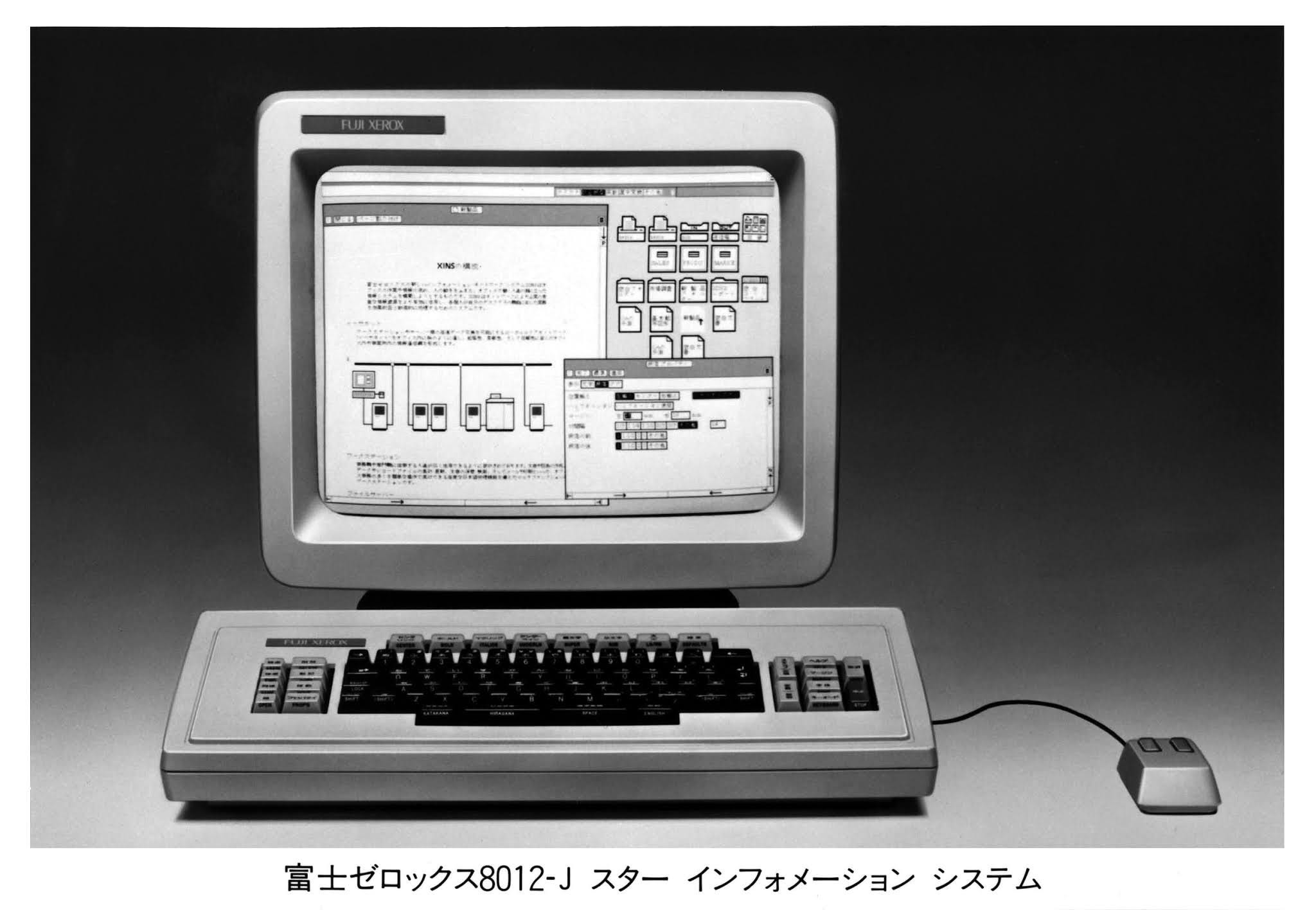
Perhaps the most famous legacy of the Xerox Star is the 'hamburger menu'. You and I know it as those three lines in the corner of our interface that we tap/click on to see additional navigation options.
Graphic design lead Norm Cox and lead designer Dave Canfield Smith used it simply as "a way to include some leftover commands that we couldn't figure out how to do better". (Canfield explaining to Sawa, 2019)
Cox saw this as the beginning of design thinking, the realisation that form and function needed to be balanced for something to stick. "Going through usability testing opened our eyes to a lot of things" (Cox talking to Sawa, 2019). Indeed, they gradually worked out a hierarchy of recognition.
This hierarchy of recognition, it turns out, applies to pretty much all iconography, not just UX design.
“when someone looked at the screen they would scan it for a particular shape and then hone in on details of that shape—much like seeing a diamond shape road sign before you see the symbol within it. We wanted to make sure you had a limited number of objects to search for. Every pixel mattered. There was no extraneous information, no decoration, everything had a purpose. And those limitations meant that we had to design something as elegant as it as simple: a timeless design style.” (Cox talking to Sawa, 2019)
As technology improved and screen real estate became more plentiful, the limitations that forced such economical use of pixels disappeared. However, the limits on people's patience and ability to 'scan' for the right shapes and details were diminishing. Not only that, but as we'll see later in this deep dive, making the most of the available screen real estate would once again come to the fore.
So we went from basic lines and shapes to highly detailed icons, and then back to flat, basic lines and shapes over the years. Design not only has to look good, it also has to feel good. This is called 'affective design'.
It’s Super Affective!
Affect And Addiction In The 90’s
In their 2008 paper "The Nature and Role of Affect in Consumer Behaviour", Joel B. Cohen et al, examine the rise of affective computing research in the early 1990s. For example, they highlight the sharp increase in volume from 923 references between 1960-1980 to 4170 between 1980-2000 (Cohen et al. p. 2).
The way they define affect is to describe an "internal state of feeling". One's explicit or implicit "liking" of an object, person, or position is considered an evaluative judgement rather than an internal state of feeling". (Joel B. Cohen et al. p. 3)
In other words, affect is how something naturally makes you feel, rather than how you might rationalise and interpret those feelings. Bringing this back to the Xerox design lesson, it's the fact that the hamburger menu has stuck around all this time because it just works, no matter how many designers over the years have wished it wouldn't.
The hamburger menu isn't particularly efficient in terms of metrics like engagement or efficiency, but it's instantly recognisable and easy to use. It's 'super affective', you might say.
Cohen et al then go on to say that "This definition also raises both philosophical and empirical questions about whether such a state of feeling must be consciously experienced, or whether we can be unaware that we are experiencing affect" (Joel B. Cohen et al p3). (Joel B. Cohen et al. P3) And boy, did that escalate quickly.
Academic research is always published with a time lag. This is due to a number of factors, such as the time it takes to actually do the research, the time it takes for peer review, the time it takes for journals to accept it, and so on. So while the paper was technically published 2 years after the invention of the infinite scroll, they are functionally close enough in terms of when the research was done.
The question of how consciously one might experience the affect of certain UX design choices manifested itself in the widespread adoption of the infinite scroll, which was invented in 2006. Affect can shape our design judgements and choices, consciously or unconsciously. It can control the vigilance, intensity and direction of behaviour, guiding users' actions and responses to different stimuli.
The Infinite Scroll And The Algorithms That Keep People Scrolling
Aza Raskin’s Infinite Scroll
Soooo.... Infinite Scroll investor Aza Raskin thought, "It's surprising how often you just give up and go somewhere else when you get to the end of a page. The problem is that every time a user has to click to get to the next page, they are pulled out of the world of content and into the world of navigation". (Raskin, 2006)
At the time, Raskin was working for a company called Humanized, which, in retrospect, isn't so darkly comic. Humanized believed that breaking a user's train of thought was the ultimate UX evil. Such an event forced the user to disengage and made them more likely to leave. Thus the infinite scroll represented a vision of never forcing the user to 'ask' for more content, 'just give it to them'. (Humanised, 2006)
And why should a designer do this? Because, according to Humanized, "the less a user's mind is cluttered with irrelevant decisions, the clearer their mind is to accomplish what they need to do". (Humanized, 2006)
More friction means more effort to get users to do what you want them to do. It means more opportunities for them to stop and think about what they want to do or not do. Quit moments occur when the answer to the question "what do I want?" is "something else".
Frictionless experiences keep users in perpetual motion, where they never 'stop' to think about whether they'd like to stop or do something else. But since you need a way to keep the stream of content flowing, you inevitably end up using...algorithms.
It’s A Trap!
Algorithms explicitly designed to keep users engaged, no matter what, can quickly become "captivating algorithms: recommender systems as traps". This also happens to be a 2018 paper by Nick Seaver in the Journal of Material Culture.
A programmer called "Mike" is interviewed by Seaver about his music app, and how he handles user onboarding and retention. "In the first week of listening to us, we're like, 'Fuck it! Play the hits!' Play the shit you know they're going to love to keep them coming back. Get them addicted. In the beginning I'm just trying to get them hooked. (Programmer Mike in an interview with Seaver, p. 2)
Um... Mr Raskin, we might have a problem with the infinite scroll philosophy... It's easy to look back at the noble intentions Humanised had with our 2024 knowledge and call them rather naive. But while they may not have succeeded in the way they probably wanted, Humanized's design philosophy represented the next big leap in design logic.
Bestselling books and countless editorials have extolled the virtues of this approach. Seaver focuses on the way these works interpret the 'hooking of users', in particular, as if they were fish to be hooked, prey to be hunted. Juxtaposing algorithmic systems with hunting tools such as tripwires and trapdoors 'not only takes the shine off them and reminds us that they too are products of ordinary human engineering; it also helps us to think about how they work, the ways of thinking on which they depend, and how they might be critiqued' (Seaver, p3). (Seaver, p3)
As you may recall, Facebook was launched in 2007 and quickly became the 'apex predator' of this new ecosystem in which the designer was the predator and the user the prey. In 2016, the ecosystem it ruled would be given a name. It would be called 'airspace'.
The Age Of Airspace
Welcome To Airspace
In a 2016 article for The Verge, Kyle Chayka coined the term 'airspace' to describe the homogenisation of taste brought about by a sense of aesthetics cultivated and reinforced by the algorithms that constantly shape what people see and engage with. .
In other words, we've arrived at the title of this deep dive. Over the course of the 2010s, algorithmic aesthetics have not only come to dominate all facets of digital life, but have also begun to significantly influence and reshape our material world, "the places we go and how we behave in areas of our lives that hadn't previously seemed so digital." (Chayka, 2016).
Chayka illustrates this by charting the rise of the home rental service Airbnb.

Chayka defined airspace as a phenomenon in which 'as an affluent, self-selecting group of people move through spaces connected by technology, particular sensibilities spread and these small pockets of geography become more similar'. (Chayka, 2016).
The most important feature of airspace is that it overcame the socio-cultural barriers that had previously separated the world's different cultures. You can now go anywhere in the world and find the same identical coffee shop or rental apartment.
The (A)Iconicity Of The Sparkle
How AI Stole the ✨Sparkles ✨ Emoji
In this context, by late 2023, AI companies began to use the sparkle emoji as a unified visual signifier of AI features and functionality. Between 2016 and 2022, people had gradually become frustrated and anxious about social media, yearning for a return to a sense of control and agency in their digital lives. The ideal among some designers and users became "features should be within reach when the user wants them, but never forced upon them".
The sparkle ✨ emoji is there in the modern UI to entice users to engage with the developer's AI capabilities, while ensuring that users feel it's their choice to do so. It promises AI that's fun, magical and innovative, rather than invasive, dull and inconvenient.
But why this emoji, out of the hundreds of other possible choices that could have been made? Tech journalist David Imel traces the initial rise of the sparkle ✨ emoji to 2021, using an infographic to show its relative popularity compared to the other most used emoji at the time:

Digging deeper, he traces the origins of the Sparkle ✨ emoji back to the first set of 176 emoji created by Shigetaka Kurita for NTT DoCoMo in 1997. Much like the limitations faced by the Xerox design team, Kurita had to make every pixel count on the cramped, low-resolution flip phone screens he was working with at the time.
As he tells Imel in an interview, the name 'emoji' came from this desire to express 'electronic emotions', which is how we got the components 'e' and 'moji'.
Kurita explains that he was inspired by Japanese manga. "There is already a culture in Japan of using symbols to represent emotions, so we chose emotions that are often represented." (Kurita to Imel, 2023) While Kurita is initially surprised when Imel explains to him how the sparkle ✨ emoji has been co-opted by Western AI companies, Kurita is not offended, but rather amused.
Memes, The DNA of Design!
He then goes on to answer that earlier ‘but why?’ question for us. It would have been too hard for AI companies to make a brand new icon stick because it has no inherent meaning attached to it, no socio-cultural context for users to intuitively grasp a hold of. Rember the Xerox Star and Infinite Scroll examples? If the design isn’t comfortable or intuitive enough, users won’t accept it.
In Kurita ’s own words, the “role of emoji is to represent preexisting things, making new emoji for AI might just feel like a corporate Logo.” (Kurita to Imel, 2023) Taking the sparkle ✨ emoji instead of making something from scratch saves not just one company, but all of them from having to reinvent the proverbial wheel. Everyone gets to benefit from the trained association amongst users.
This process of AI companies essentially taking the existing meaning and context of the sparkle ✨ emoji and changing it into something new is called ‘memetic mutation.’ Memetic mutation basically applies Charles Darwin’s theory of evolution to memes, meaning they adapt and evolve over time to better adapt to their environment.
Memes in this case likely don’t mean what you think they do though! Believe it or not, the original definition of ‘meme’ was first conceptualised by Richard Dawkins in his 1976 book The Selfish Gene. Dawkins was rather obtuse about it, but later interpretations saw memes as living, evolving structures akin to ideological viruses or DNA. Incidentally, that’s also how we got hilariously unhinged yet technically accurate pop-culture gems such as ‘memes! The DNA of the soul!’
It's a bit confusing, but this dual role as virus and DNA is how the original version of the meme worked. Like DNA, it encodes data and spreads. Like a virus, a meme is contagious and can spread through ideas, behaviours and styles that people imitate.
Thanks to the iconic nature and recognisability of the emoji, this aesthetic can reach any person, from any culture, through an intuitive understanding built up over years of collective context and meaning.
To conclude, "AI is a meme, and the sparkle ✨ emoji has become the vector through which it spreads across socio-cultural divides. Becoming sparkly is the latest mutation of the algorithmic aesthetic. It will certainly not be the last. But so far, the four major mutations we've discussed are Xerox Start, Infinite Scroll, Airspace and, most recently, the integration of native AI into the smartphone. We're still in the middle of the 4th.

Through trial and error, Xerox designers discovered the design principles that would define graphical user interfaces for decades to come. Razkin and Humanized took those lessons and consciously applied them to a new design philosophy.
The constantly fine-tuned and re-adjusted algorithms that powered our infinite scrolling would eventually give rise to the Airspace aesthetic, where we were all individually steered towards the same stylistic choices.
Resistance to this homogeneity gradually grew, and I believe that many of the current controversies surrounding AI are part of this ongoing reckoning with our desire for uniformity on the one hand, and our craving for self-expression and individuality on the other.
As a result, there's an inherent duality to the 'AI sparkle' ✨ emoji. It's meant to be universally recognisable and intuitive, yet the current design vanguard are each trying to find their own way to preserve what Imel calls the "'look over here' and 'a little bit of magic' effect" (Imel, 2023) that made this particular emoji so appealing to businesses in the first place.
My advice to you is simple: walk the razor's edge. AI is a burger menu for the modern age. Put in those features that are too experimental or niche to clog up your 'main UI'.
Let it fill in the gaps of user requirements that you can't provide. Whatever features you want or need, you can let AI provide them, but you must never confuse them with your entire product.
Wait... did we go through all this just to conclude that 'AI is a meme'? Yes, we did! I hope this story about the evolution of algorithmic aesthetics has put AI into perspective. It's not some apocalyptic, job- and life-ruining monster beyond our control; even the worst things done with algorithms have always been designed to do what they do by someone, somewhere.
AI is also an algorithm. Algorithms need design, they need to be presented in a way that makes sense to users and appeals to their sensibilities.
What will those sensibilities be? A taste for hamburger menus, an infinite scroll, a cosy room that follows you around the world, or something we've never seen before. I'm excited to find out.
Written by Tim Groot (Tech) & Martijn van der Does (Design)